____
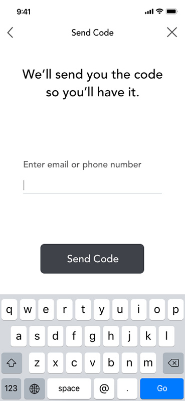
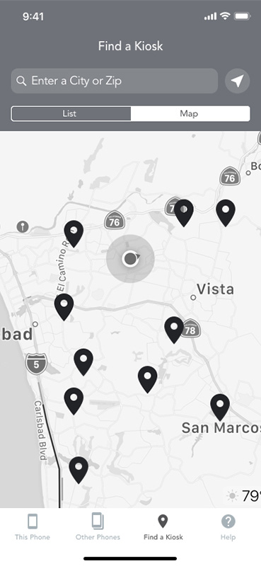
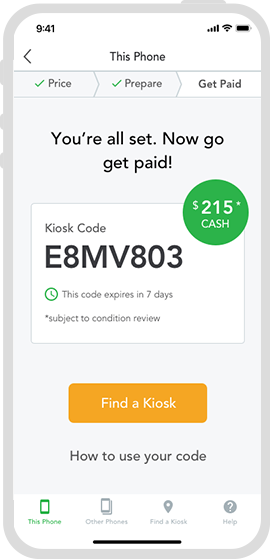
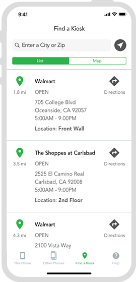
EcoAtm is a global device recycling kiosk. It lets people recycle their old devices conveniently and make some extra cash in the process. Sounds great to me. For this project, I worked with the UX team to audit the current experience of their companion app and design a more intuitive, attractive, and usable product.
Jarrod Hammes, Director, Product Management
Melisa Kao, Senior Interaction Designer
Marilyn Tahl, Usability Consultant
Primary font family
A B C D E F G H I J K L M N O P Q R S T U V W X Y Z
a b c d e f g h j k l m n o p q r s t u v w x y z
0 1 2 3 4 5 6 7 8 9 ! @ # $ &
Avenir Book
Avenir Roman
Avenir Medium
Avenir Medium Oblique
Avenir Heavy
This teardown was from the perspective of a new user (myself). No holds barred. My initial impressions of the experience as well as some recommendations throughout.
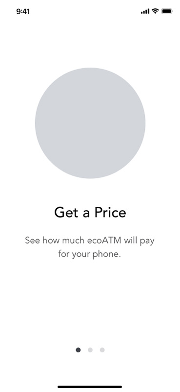
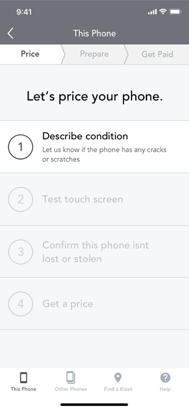
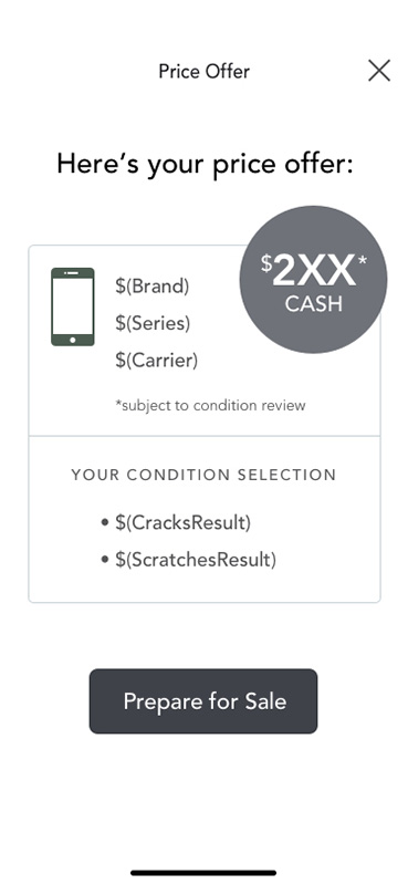
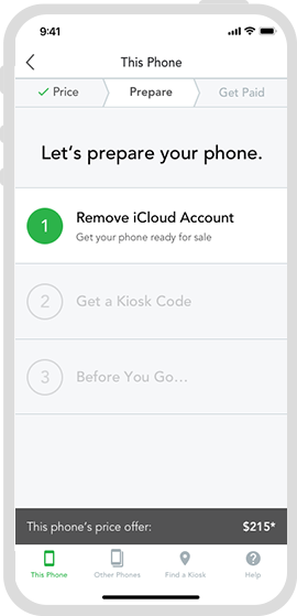
With recommendations and access to user research, I dove into the wireframe portion of the project to streamline and improve the app experience.


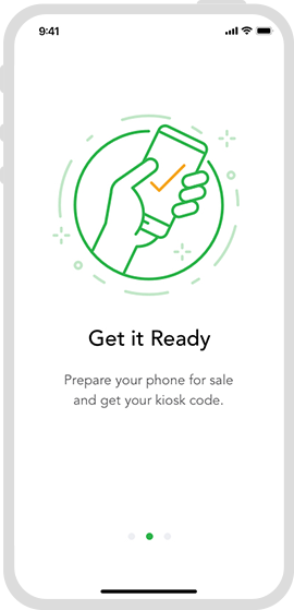
With the newly defined direction in hand, I then made visual design recommendations for typography, color, and visual treatment. It’s nice to see that this app is still in use today.
UX Audit
User Experience
UI Design
App Design
Self
ecoATM